STAFF MANAGEMENT | SMX: WEBSITE REDESIGN
Since 1988, Staff Management | SMX has partnered with hundreds of companies across North America to provide innovative solutions for complex labor challenges. Their strategically engineered onsite staffing solutions are driven by actionable data to ensure client manufacturing, fulfillment, and distribution operations are as efficient and scalable as possible.
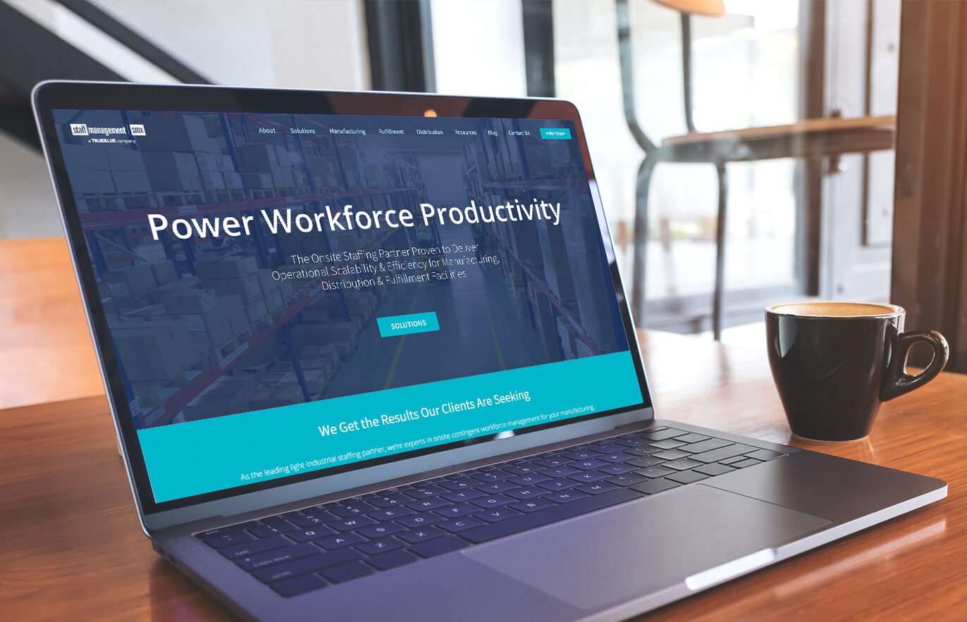
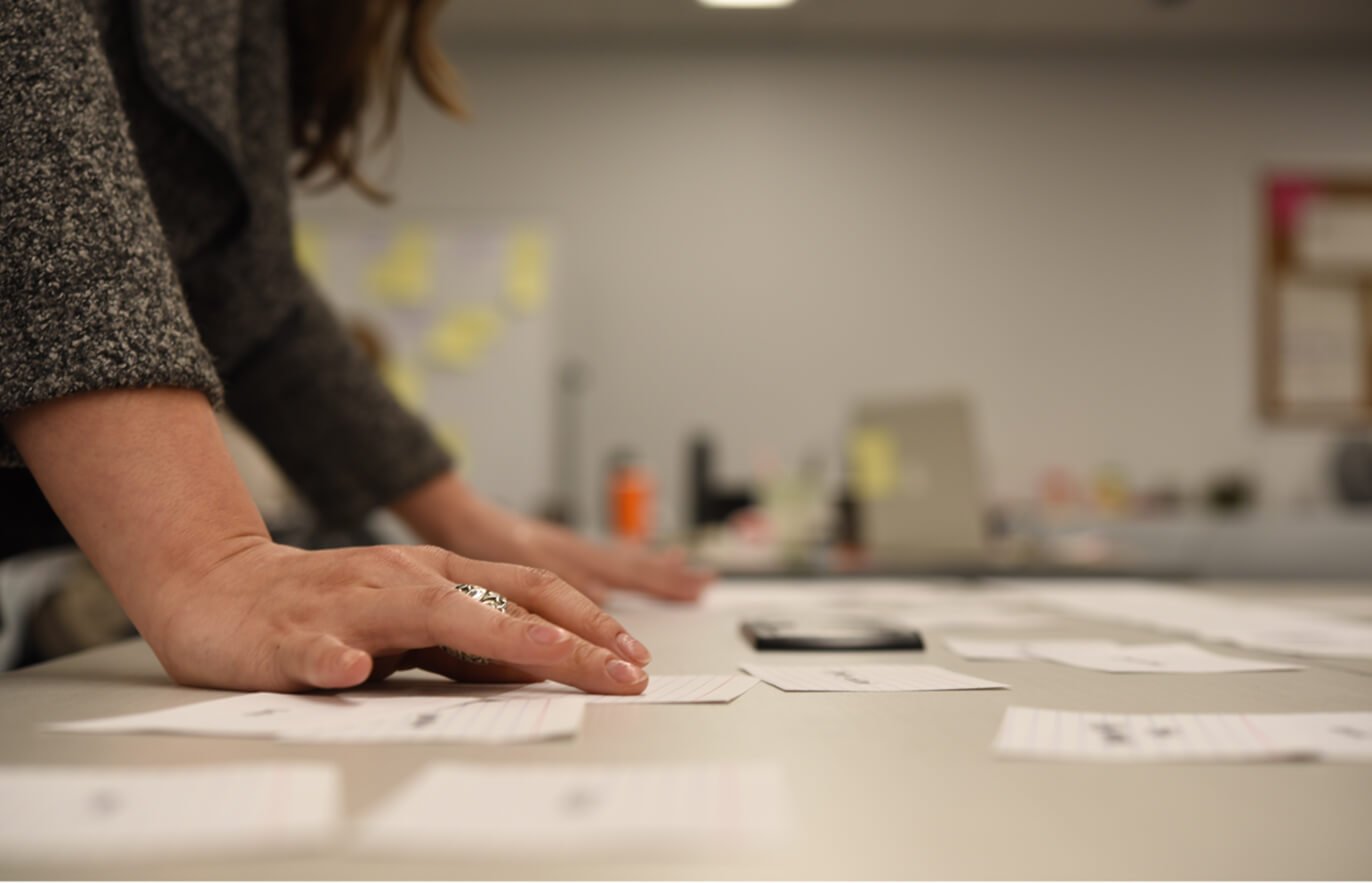
We were tasked with redesigning staffmanagement.com in an attempt to increase sales and improve ease of use across all device types. I served as the principle visual and user experience designer on this project, and the team started the redesign with a day-long workshop at the Staff Management office, where we focused on:
Business objectives.
Personas and target audience.
Analyzed client interviews.
Content needs.
Brand characteristics.
Card sorting.
Our week long workshop helped us shed light on the three major problem areas: home and navigation and design. These areas are discussed in more detail below.
USER PERSONAS
We created user personas to help us stay focused on user needs. Here’s a small section of them:

THE CONTENT
A big part of this design overhaul was the information architecture. The old site had tons of content but, as I mentioned above, it was fragmented and unorganized. We had plenty of new content we wanted to include as well, so sifting through and categorizing it all in a way that would make sense to our target audience was a task that while time consuming, proved very valuable.

HOME AND NAVIGATION
We reworked the site’s homepage and global navigation in an attempt to help the user focus on the most important navigation items and content: apply now, meet the team, and the company’s history of success. The initial structure of the website was fragmented and unorganized, and users were unable to locate key materials. We conducted a content inventory to categorize existing and new content and then conducted several card sorts to inform the new information architecture. Our goal was to change the language of the Staff Management website in order to match the user’s mental model and vocabulary.
We also sought to give users a clear path to their target goals. For example, many job seekers were often confused by the complex information architecture and would fail to accomplish their goals. To solve for this, we added large “Apply Now” button, hoping to filter out job seekers from clients by putting the apply button front and center on the homepage.


THE DESIGN
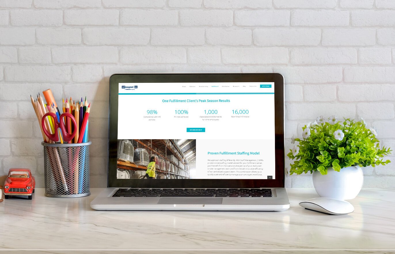
We worked to refine page layouts and visual design in support of the content. We converted our wireframes into a functional WordPress site built with the Avada theme. We took a pseudo-Agile approach, checking in and piecing together the experience one feature at a time. This lead us to explore motion and layout with a fine-toothed comb to help us compose interactions that fit within the confines of the WordPress theme.
THE FUTURE OF THE STAFF MANAGEMENT SITE
We built the Staff Management website so it could be expanded upon in future iterations. We included only the most important features and information so as to remove the clutter that was featured on the original site. As the site continues to mature, we will be able to collect feedback on what needs to be added and improved upon to refine it to better serve the user experience


