RESPOND-R: MEDICAL EMERGENCY RESPONSE SYSTEM
RESPOND-R, is a proposed medical emergency response system to be used in ambulances and other emergency response vehicles. This system would provide emergency response personnel with all the necessary information regarding a patient’s medical condition, their whereabouts, and more. This system would expedite emergency response to patients in need as well as enable responders to treat the patient more effectively with efficient access to medical history.
RESEARCH
The Personas
After exploring all the potential users of the proposed emergency response application, the team identified two key users that are central to the team’s intended build. These users included the Emergency Dispatcher, who manages all incoming emergencies and delegates to Emergency Responders, who is an active medical professional in the field responsible for tending to patients and delivering them to hospitals.
Design Charrettes
To manifest as many ideas as possible, each team member created preliminary sketches. The team reviewed these sketches and came to consensus about the general design and thought about how idealized use — or “happy paths” — might be laid out. This stage of the project was heavily focused on the high-level processes of the conceptual application.
Moodbaords
After gathering a variety of existing designs already out there, moodboards helped the group pick the design direction in which the application was designed.


DESIGN
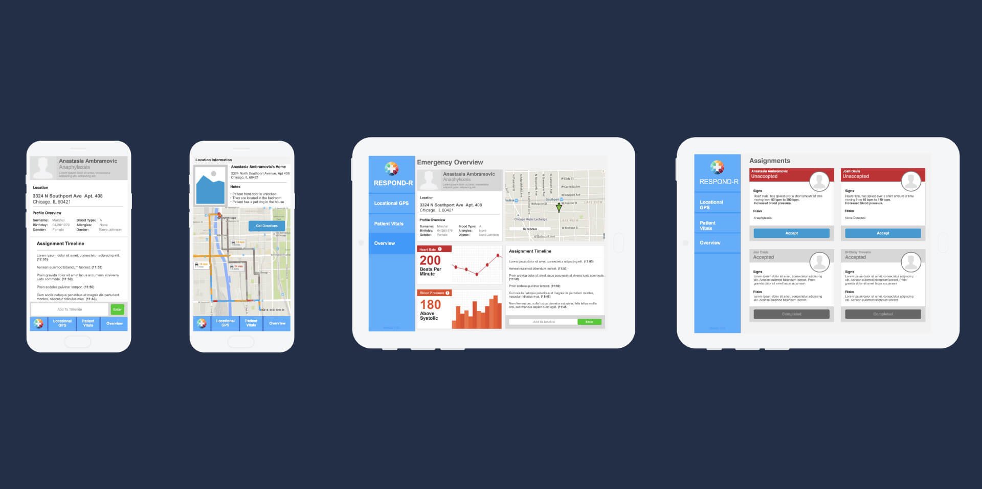
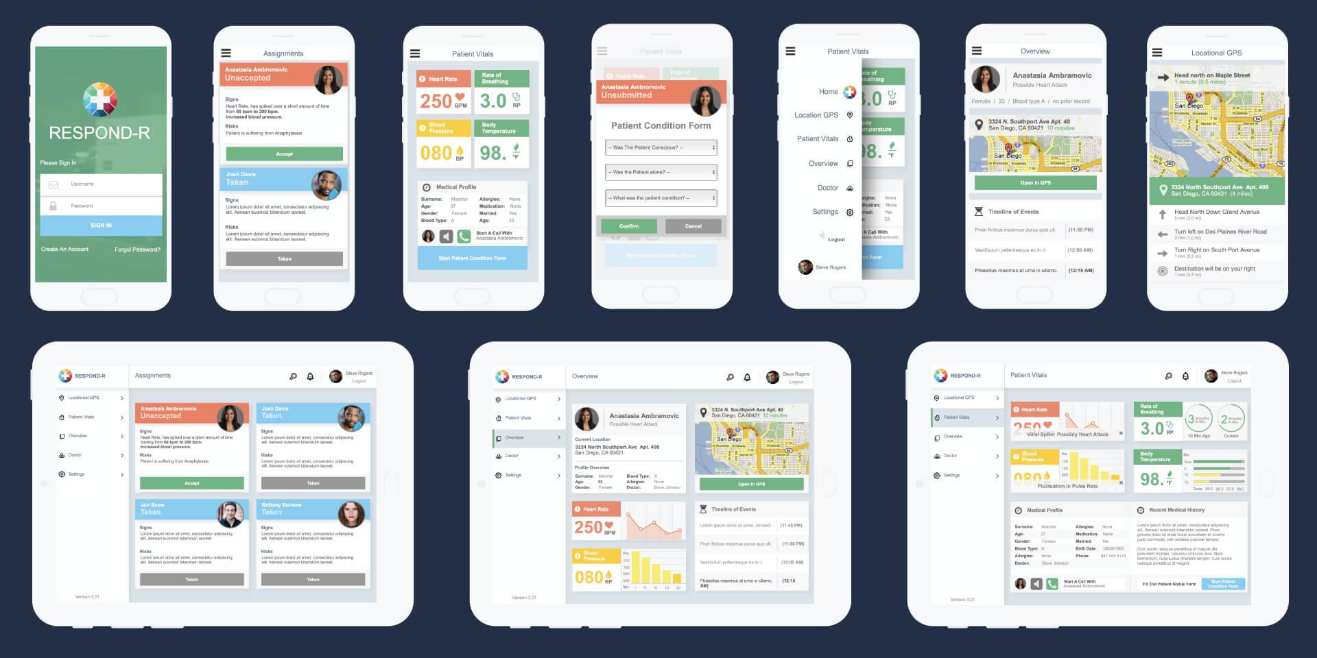
Mid-fidelity prototypes were designed from a culmination of previously mentioned exercises (moodboards, storyboards, etc.). For this prototype, the team focused on the in-the-field Emergency Responder role because it is most critical to the functionality of the application. The mid-fidelity prototype began our design process and was a great place to iterate before putting the final touches on a high-fidelity prototype.
USABILITY TESTING
Usability testing was conducted on both the mobile and tablet mid-fidelity prototypes. The team tested to see if users were able to complete all the necessary tasks critical to the usage of the prototype, assessed the difficulty of use of the prototype, and confirmed whether or not the user understood the information being presented to him or her within the prototype. This testing strongly influenced any changes made in the development of the high-fidelity prototype.
Tablet
Usability testing revealed that users generally understood the information being presented to them, could easily interact with the prototype, and accomplish all assigned tasks. However, it also revealed that certain critical tasks were confusing to users and certain tasks did not seem to make sense
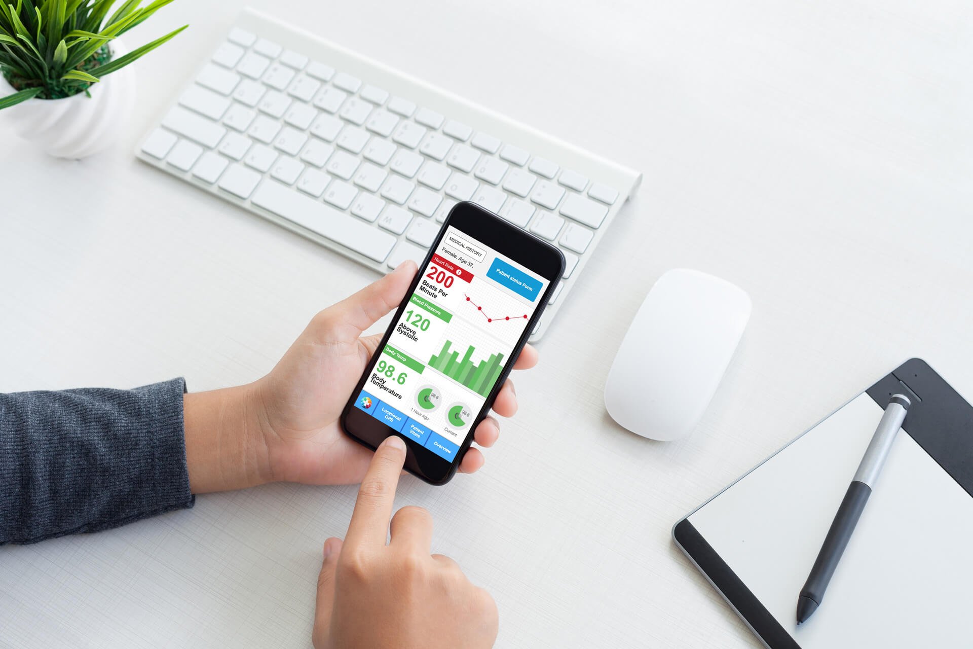
Mobile
The mobile view of the prototype identified more significant issues compared to the tablet version. While the user completed most of the tasks assigned, they were not able to reach a critical screen, thought that certain elements of the prototype were vague and unnecessary, and did not understand certain parts of the prototype.
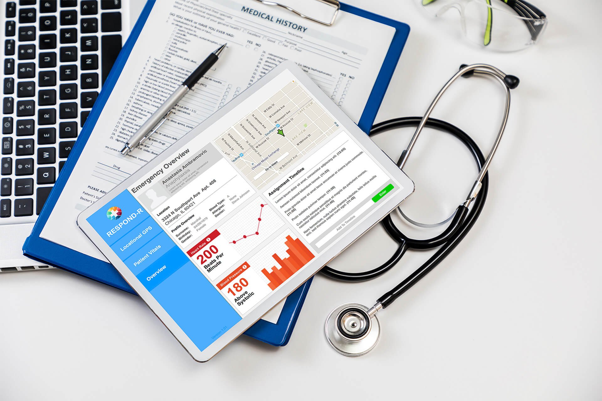
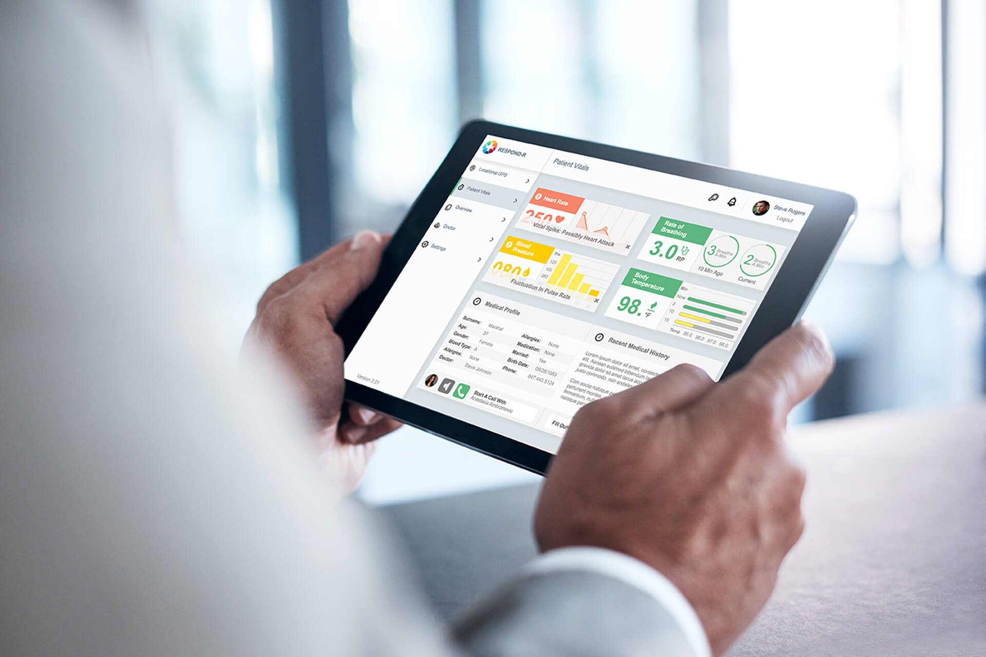
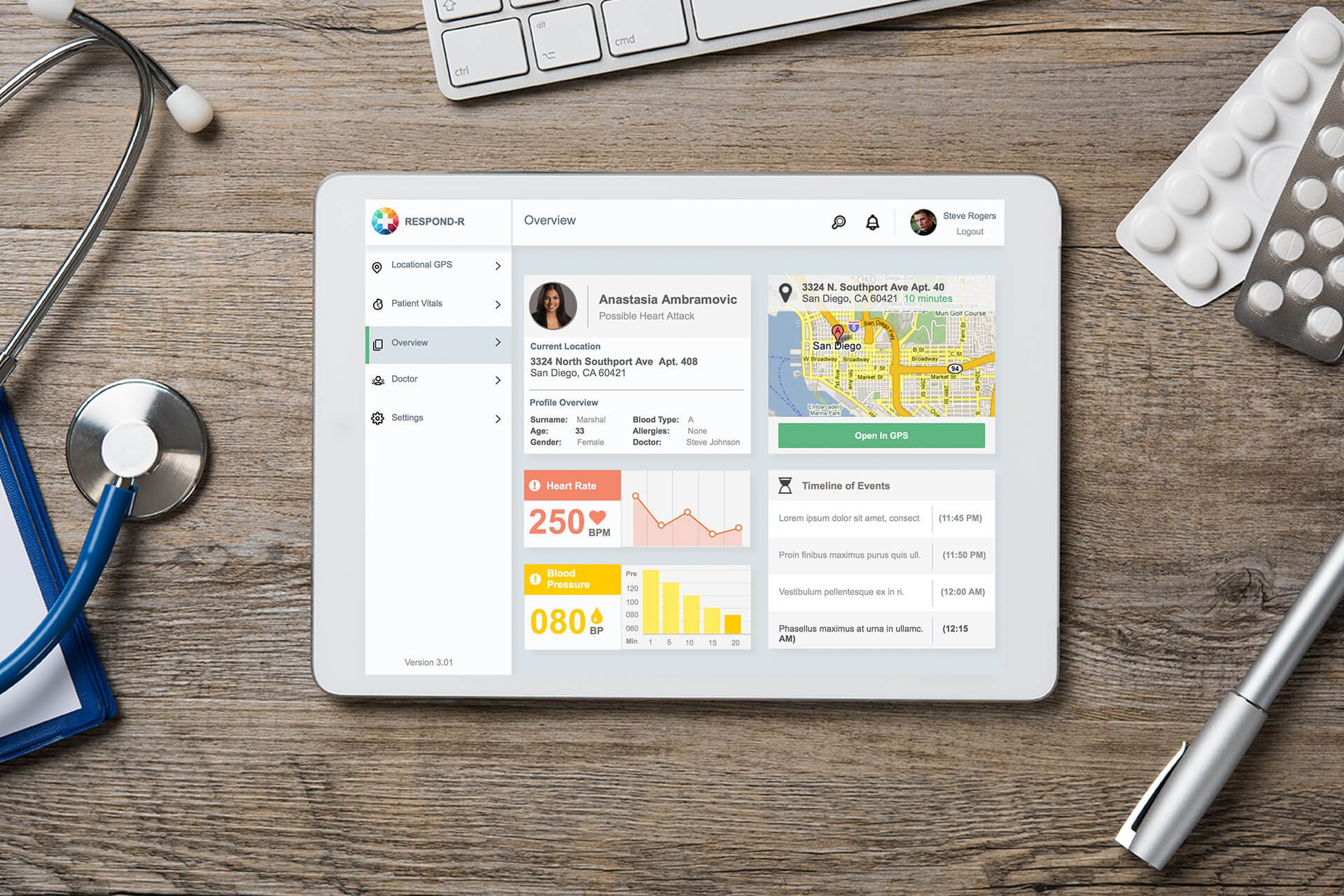
HIGH-FI PROTOTYPE
After completing the usability tests and spending some more time working with the mid-fidelity prototype, the team created a high fidelity prototype. They incorporated branding and created a polished look.
LESSONS LEARNED
Being flexible with our process allowed us to uncover better ways of working together which resulted in a better end product.
Early and Often
Involve everyone in the process early. Even if it’s just sharing sketches, early engagement leads to shared ownership and facilitates cross-team collaboration.
Cross Pollinate
Take the opportunity to have engineers/coding minded individuals help make design decisions, and let their technical know-how influence the product.
It’s Never Been Done
A design system is never done. It constantly evolves and improves as we learn more about the ecosystem it supports, as well as its users.